Goal and Background:
The objective for completing Lab 3 in GIS 1 was to gain experience in obtaining data from the U.S. Census Bureau's website, transforming a standalone table into workable data, joining attribute tables together, and displaying the data appropriately as a static map and a dynamic map on the web.
Methods:
To initiate the Lab 3, I downloaded the TOTAL POPULATION dataset from the U.S. Census Bureau's website under its 2010 SF1 100% Data. I specified the dataset for all counties in Wisconsin under the geography tab. After downloaded, I unzipped the data which included the metadata and tabular data amongst others. The tabular data, called DEC_10_SF1_P1_with_ann.csv, was manipulated slightly (DOO1 changed to POPN_10 and the second row was deleted), and saved as a MS Excel file so it could be utilized in ArcMap.
Next, I returned to the U.S. Census Bureau's website to download Wisconsin spatial from the map tab in the geography window and saved it as a shapefile.
I opened ArcMap and added the Wisconsin shapefile and the MS Excel sheet to the data frame. As the goal was to map population, I viewed the tabular data and the attribute table and identified the fields GEO#id and GEO_ID as key terms for a one-to-one cardinality join. A new attribute table was formed as a result, combining information from the standalone table and the shapefile. Afterward, I exported the joined table as its own shapefile and added it to the data frame. I removed the previous layers and displayed the new one, symbolizing the population as a graduated color map with monochromatic colors. I added 8 classes as I thought it displayed population levels per county well.
I opened an additional blank map in ArcMap afterwards and repeated the previous step=]\
. This time, I chose the Housing Units dataset from the U.S. Census Bureau's website. Repeating the same steps, I joined the standalone table and the Wisconsin shapefile attribute table together using the same ID fields, exported and displayed as a new layer. The Housing Units field were then displayed as a graduated color map with monochromatic colors with 7 classes. I gave the layers a NAD 1983 Stateplane Wisconsin Central projection and did the same for the Total Population map.
Once the two maps were completed, I switched to layer view and prepared each map with a title, scale bar, north arrow, legend, author, date, and sources, arranged in a cartographically pleasing manner (Figure 1 and Figure 2).
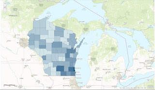
The second part of the lab involved making my Housing Units map into a dynamic map. First in data view, I signed into ArcGIS Online using my information. There, I published my map as a feature service.
Once that was completed, I signed into ArcGIS.com. Here, I added my layer to a topographical base map. I configured a pop-up window titled Housing Units per County that would show county and and number of housing units if the user clicked on a part of the map. At the end, I saved the pop-up and shared the dynamic map (Figure 3).
Results:
Figure 1 shows the first map that was created which displays the population of Wisconsin counties in 2010 as a graduated color map. The most densely populated counties lie to the south eastern part of the state. Figure 2 shows almost the same pattern of density as a graduated color map but displays housing units in 2010 instead. Figure 3 is the final product of the housing units per Wisconsin county layer displayed as a dynamic map on ArcGIS Online over a topographic base map.
Figure 1
Sources:
TOTAL POPULATION (2010) [Download] U.S. Census Bureau. https://factfinder.census.gov/faces/nav/jsf/pages/searchresults.xhtml?refresh=t. [March 2017].
Housing Units (2010) [Download] U.S. Census Bureau.https://factfinder.census.gov/faces/nav/jsf/pages/searchresults.xhtml?refresh=t. [March 2017].
Price, M. H. (2016) Mastering ArcGIS. New York, NY: McGraw-Hill Education.


No comments:
Post a Comment